I created a messaging strategy and developed UX content to explain a new search experience across two applications. It was the first time product and UX partners worked with a content designer.
How do you sunset a legacy application without degrading an existing user experience for Federal employees?
We created a UX content solution for a Federal Agency to best accommodate an engineering necessity. But since it was the first time the teams worked with a content designer, the goal was simply to introduce the content design process. We protected the quality of the UX as best we could – through clear messaging.
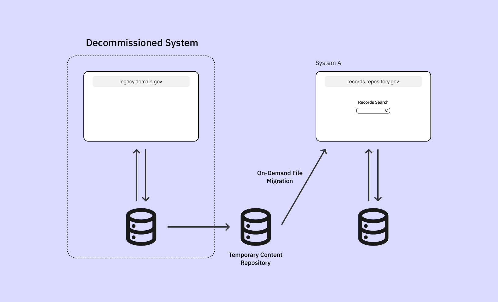
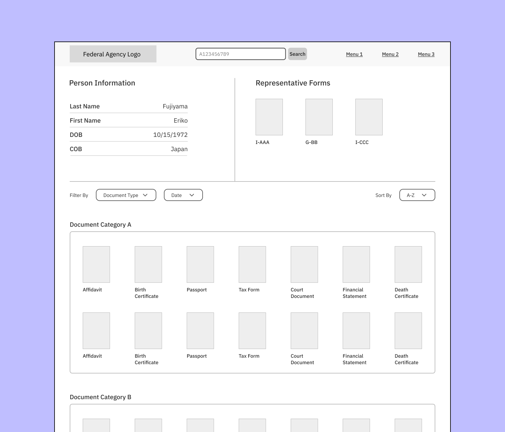
As part of the decommissioning process, records from another information system were transferred to a separate content repository where Federal Employees can request them on-demand. This web application – let’s say, System A – is the main repository that stores records related to immigration benefit applications (ex. applying for a Green Card). Employees rely on these records to approve or deny a benefit.
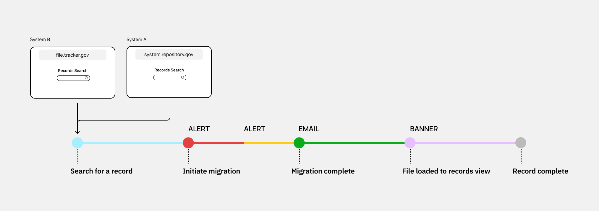
Later, we discovered another entry point for users to initiate a file migration. This web app – let’s say, System B – tracks the movement of records across the enterprise ecosystem. Users can also search for a specific record located within the legacy system through System B.
How might we best communicate the new concept of “on-demand” file request?
Users expect instantaneous results when they search for records. The on-demand file migration caused delays in file access and may disrupt their workflow. This was a temporary workaround while the records data from the legacy system was being “cleaned.”
Business Goal: Minimize the backlog of support tickets related to on-demand file request so the development team can maintain velocity.
Experience Goals:
- Explain delay without alarming the user. The message is potentially unexpected from what they’re used to.
- Minimize user questions about where the file is. Our Operations Team already receives support tickets and emails with this question. We shouldn’t add to their backlog.
- Ensure users don’t perceive the situation as a system error. Let them know the migration is automatic and no action is needed on their part.
- Reassure users that they’ll get a confirmation email when the file is ready for viewing. Let them know how long it might take.
Constraints:
- Use established design components.
- Migration times can vary. Account for delays.
- Migration is automatic. Users can’t back out.
- Minimize impact on screen real estate. Records View is where the data is displayed and should be the core experience.
Scope
I worked with a UX designer to define the scenarios and create UX content for System A.
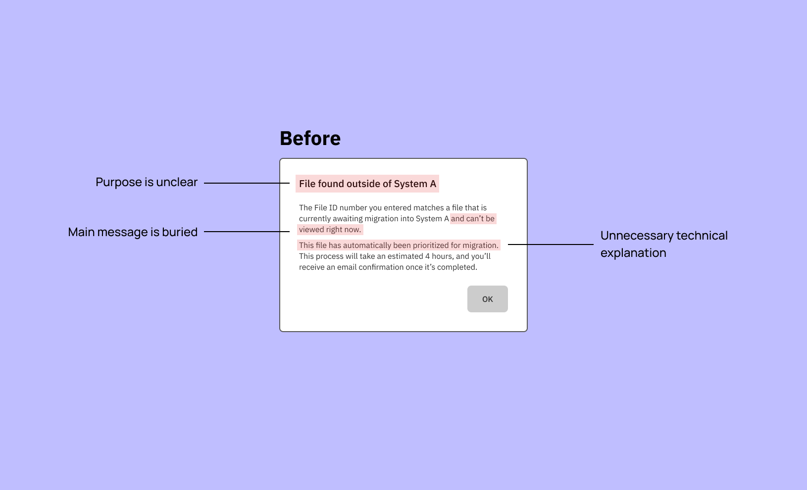
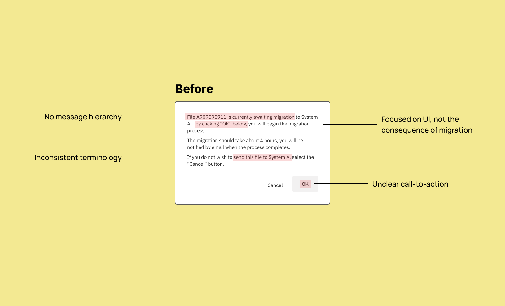
Diagnosing the problem:
- Messaging is vague, and is system-focused rather than user-focused
- Information hierarchy needs revision
- Sentence structure is unnecessarily complex, and uses passive voice
- Avoid using ableist language
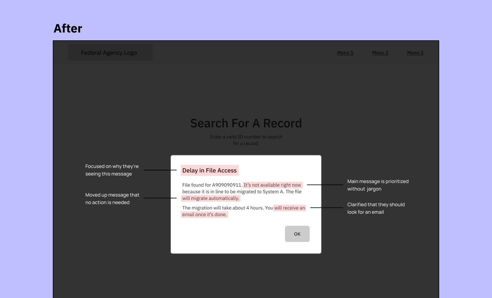
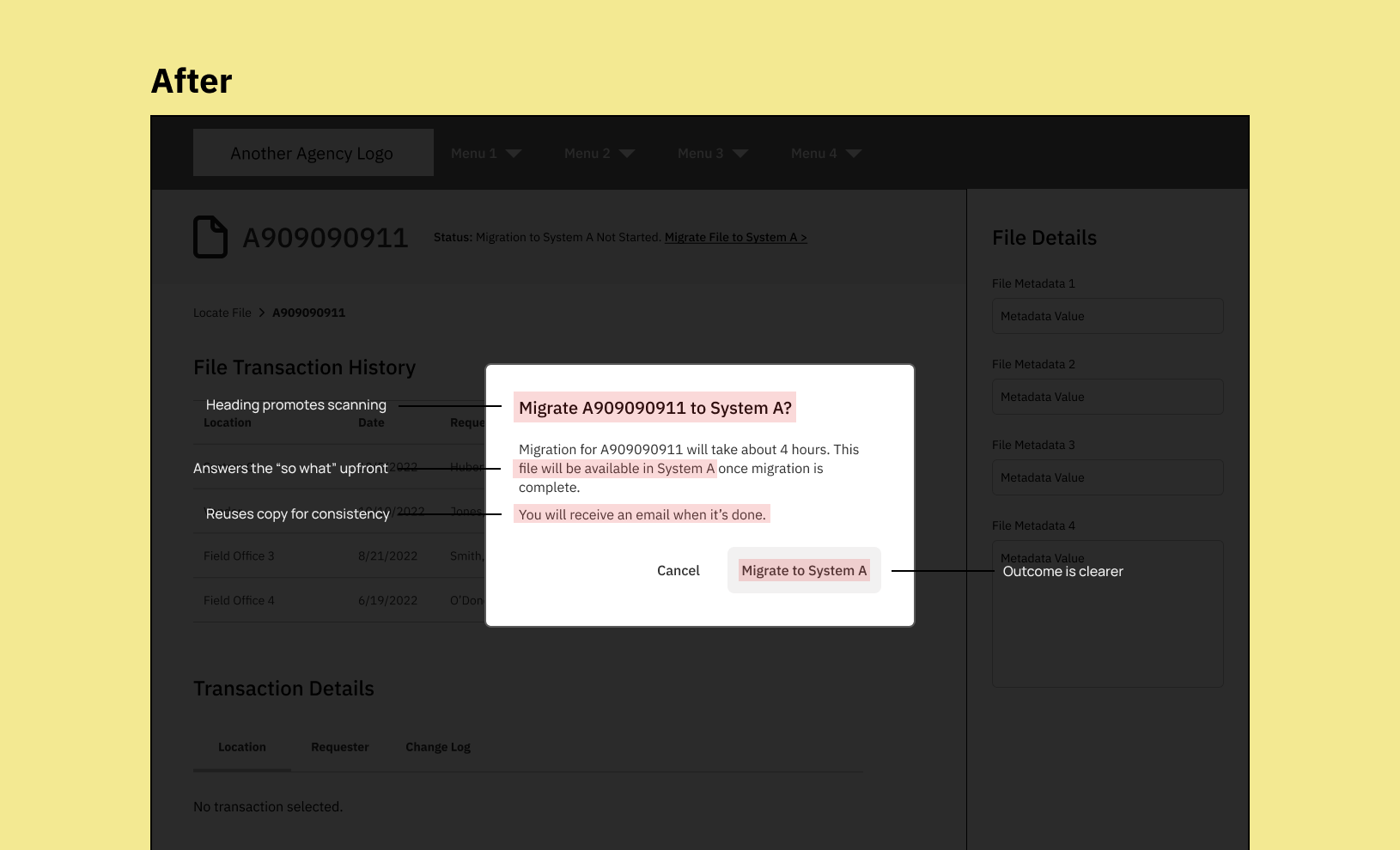
What changed:
- Clarified why the file is unavailable from user’s POV, not explain background system processes
- Added next steps to set expectations instead of keeping users waiting
- Focused the messaging on the “so what” or “what’s in it for me”
- Reduced content reading level
- Kept language inclusive by removing words like “viewed”
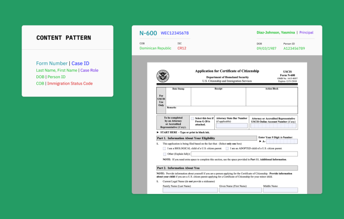
- Introduced content patterns for reuse if needed
Deliverables
Because this was a Federal Government client, names of internal IT systems and UI features have been redacted. All visuals are recreations in Figma. They’re not 1:1 (for good measure), and all examples do not contain real data.
- Timeline: 1 week
- Artifacts: messaging guidelines, copy deck, content pattern recommendations
- Tools: Confluence, Adobe XD, Hemingway App
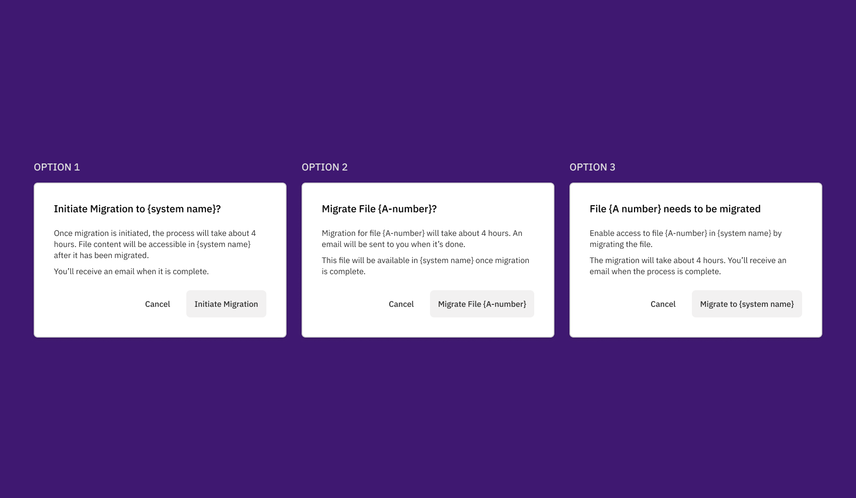
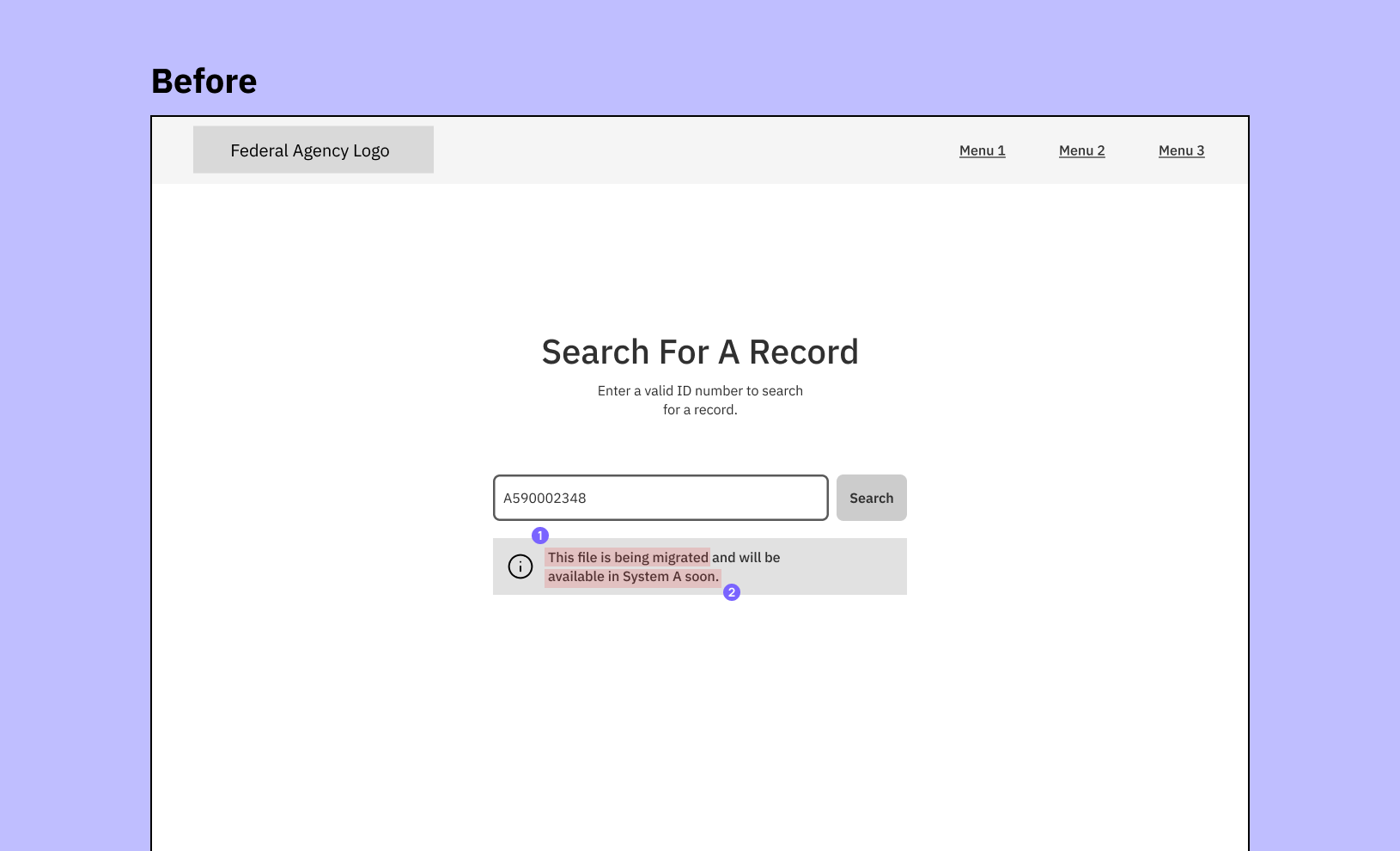
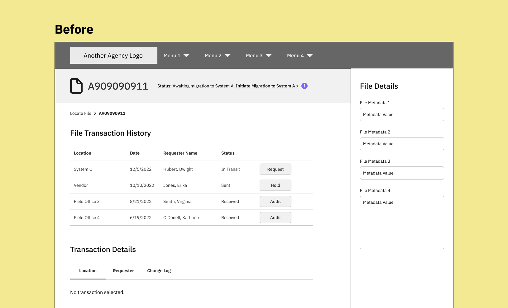
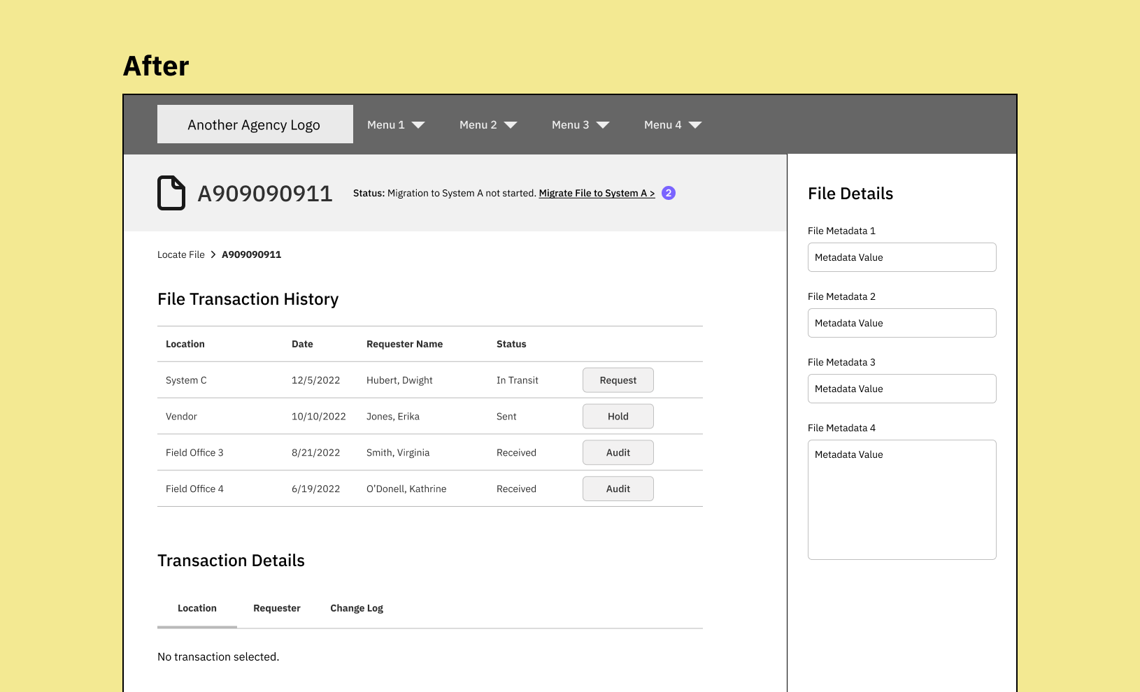
Scenario 1: Migration hasn’t started yet
The file migration isn’t automatically initiated until a user searches for it and a matching file is found. The before and after UX content was revised and then reviewed with the team:
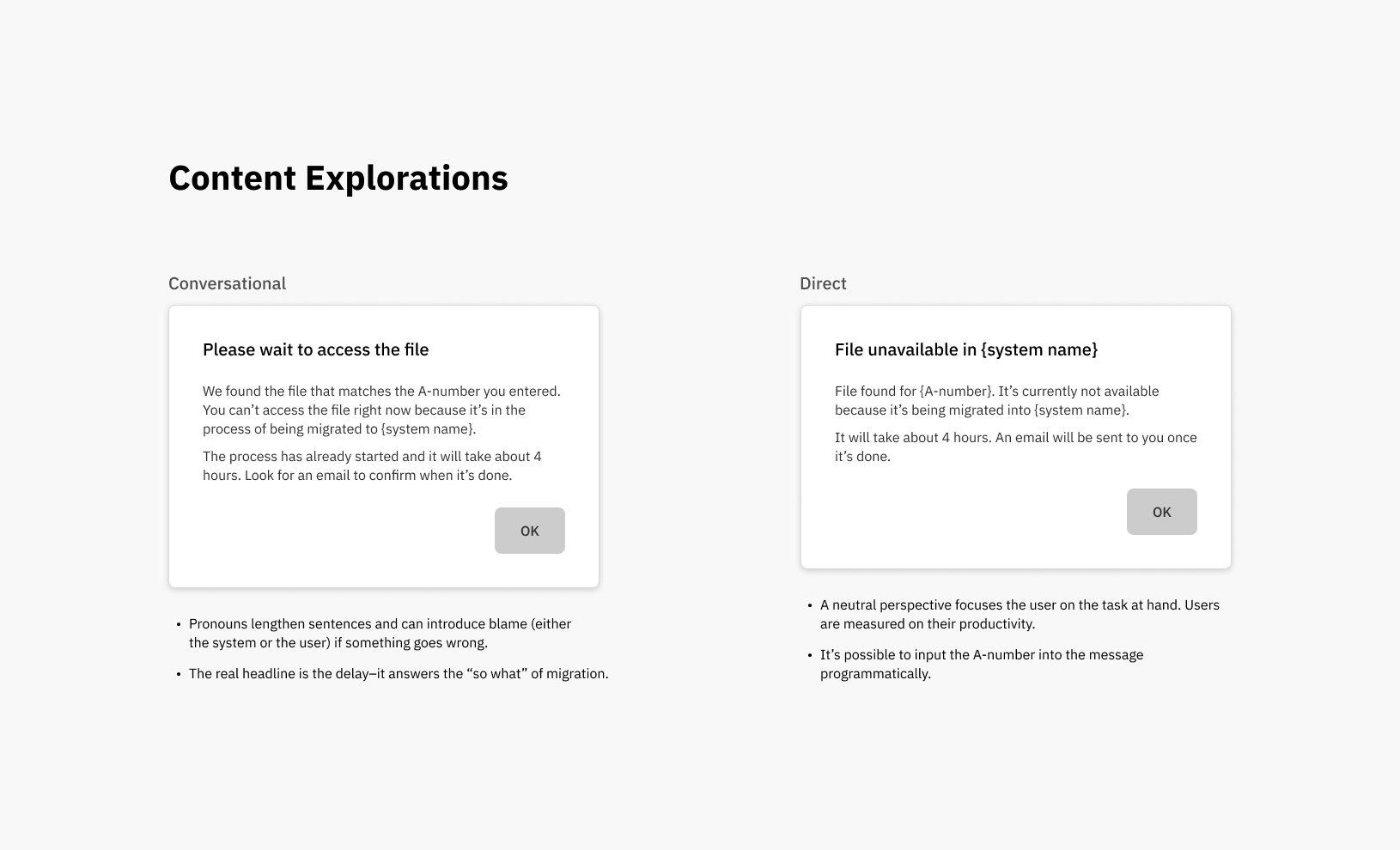
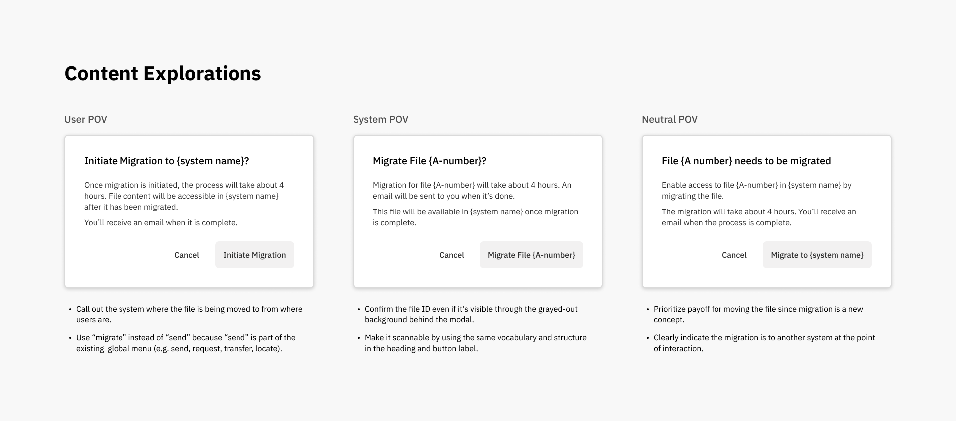
I explored content design directions from multiple perspectives to communicate the message. The rest of the content should be written from that perspective to keep the experience consistent.
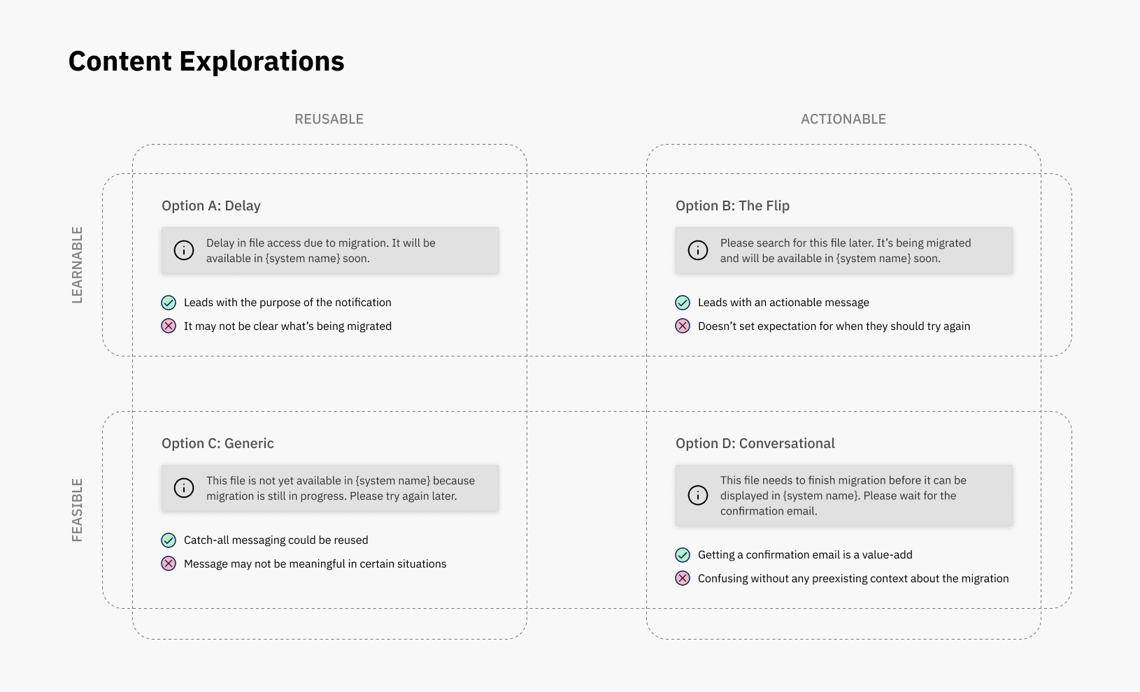
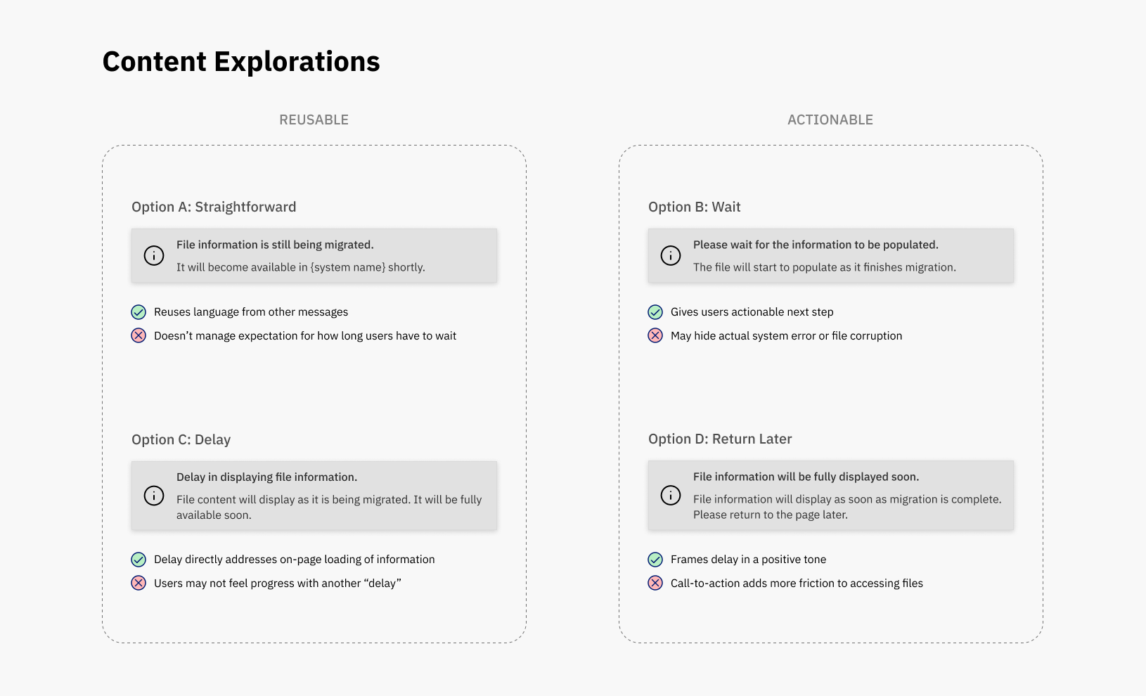
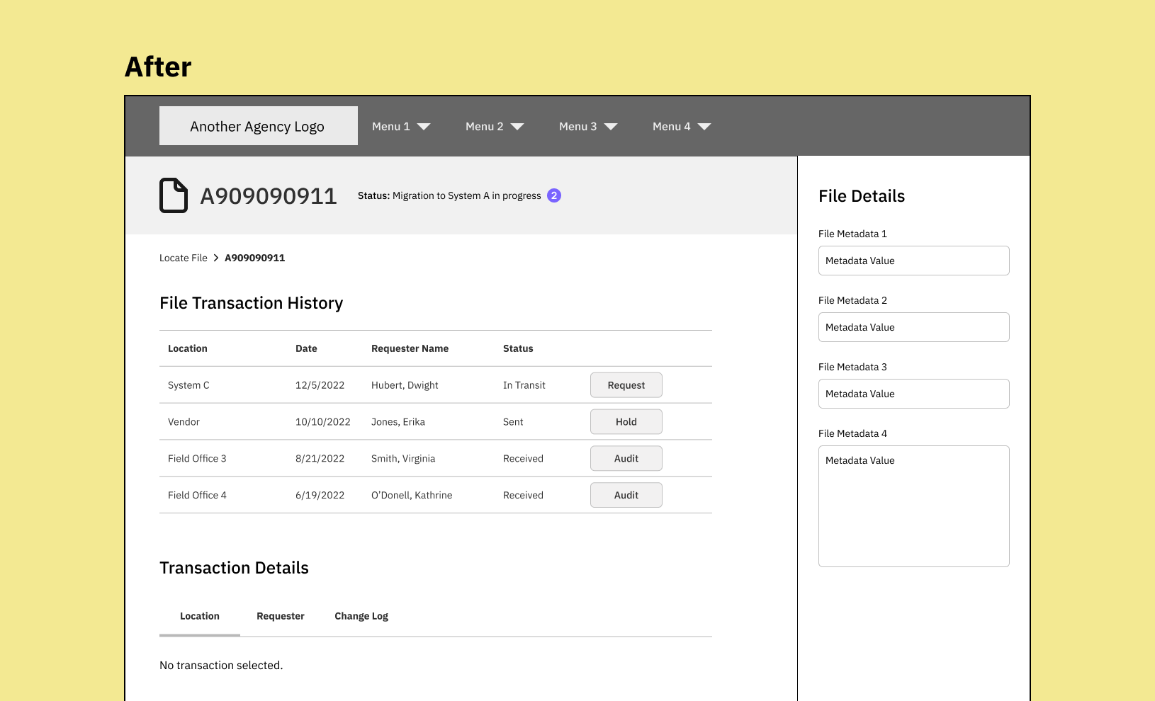
Scenario 2: Migration is in progress but records data isn’t ready to be displayed
Sometimes the migration is already in progress but a “shell” page hasn’t been created for the records data. The messaging needs to make sense to both the user who searched for the file and those who happened to encounter a file in the migration process.
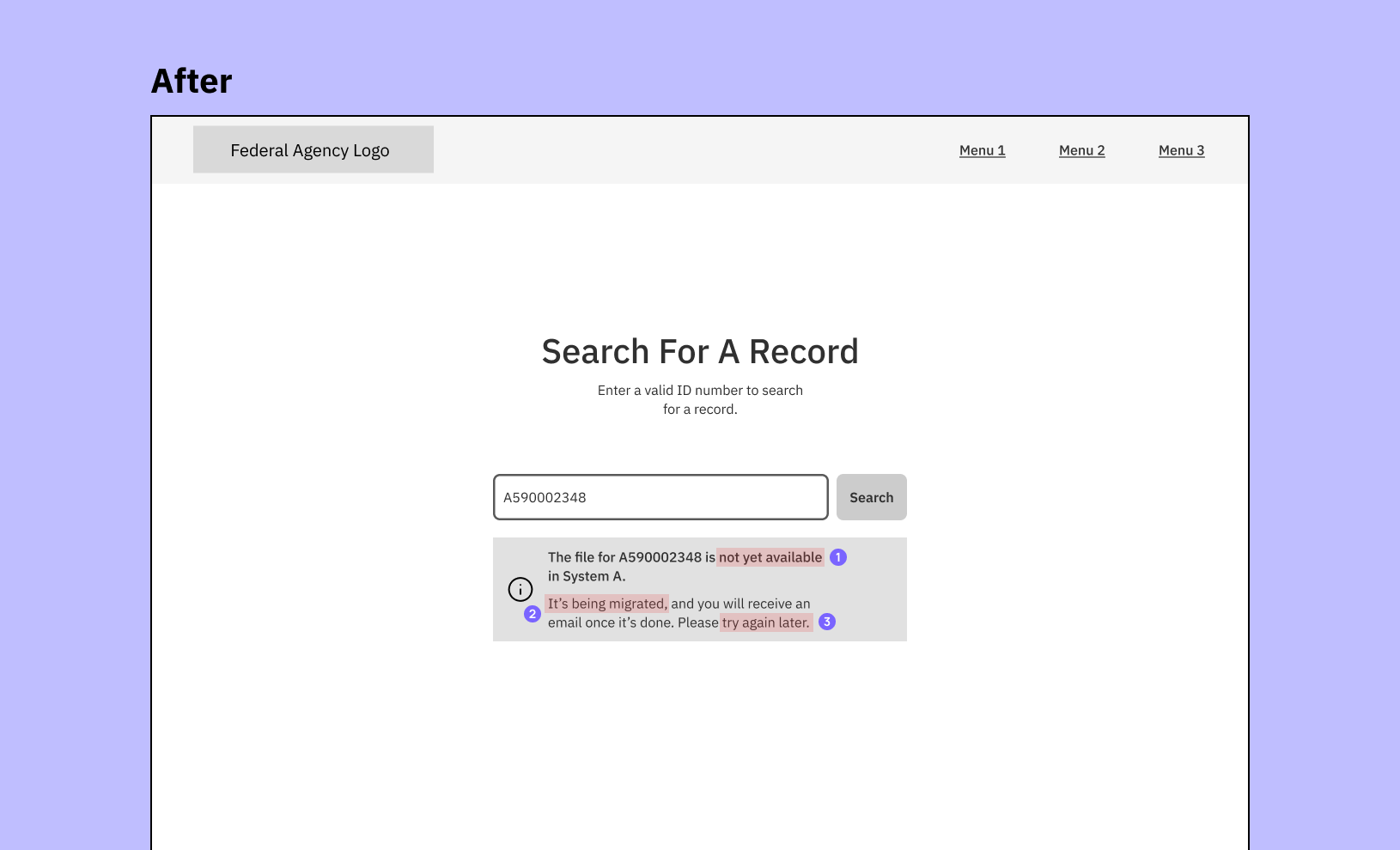
I explored different tradeoffs to balance technical lift (feasible, reusable) and UX (learnable, actionable).
Scenario 3: Records data is ready to be loaded on a page but it’s not instantaneous
Sometimes a file is completely migrated but the content hasn’t completely loaded onto the page. The message could encourage users to create new support tickets (i.e. “I see the page but why isn’t it loading any data?”).
After a discussion with an engineer, it appears that this state only lasts about 2 minutes. The generic messaging didn’t address this temporary state.
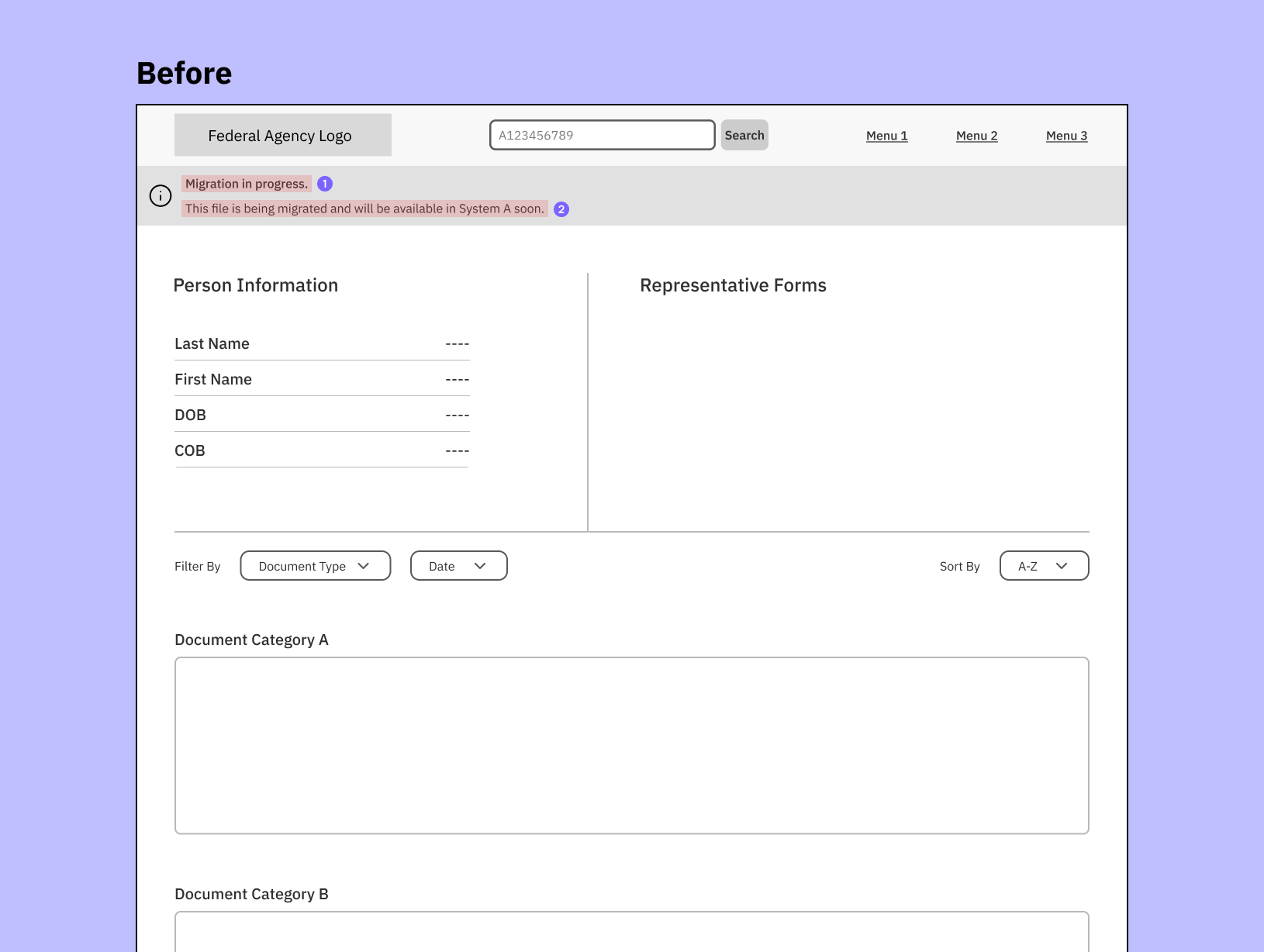
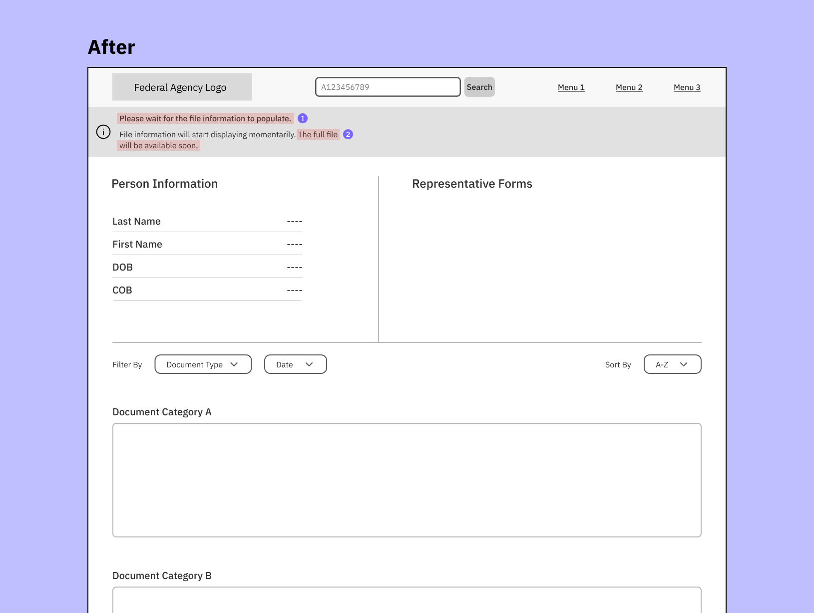
The complete record should contain all content, data, and documents linked to a person.
The focus was on whether copy patterns could be reused for consistency or to customize messaging for the context to set clearer expectations.
Keeping the Messaging Consistent Across Platforms
The UX designer and I discovered that users can also start a file migration from System B, which tracks all file movements, both digital and physical, within the Federal Agency. The UX content needed to be as consistent as possible between System A and System B so the messaging doesn’t conflict with one another.
Additional Scope
I worked with another UX designer on System B’s product team to connect the two experiences and ensure the messaging was clear and helpful.
Diagnosing the problem:
- Lack of clear information hierarchy
- Unclear calls-to-action
- Wordiness gets in the way of understanding the message
- Jargon and technical words reduce learnability
What changed:
- Added heading to create information hierarchy
- Condensed message for concision
- Created clearer and more specific calls-to-action and aligning them to the main message
- Simplified language and content reading level
Deliverables
Users are prompted to start the migration once the matching file is found. The before and after UX content was revised and then reviewed with the team:
System B already lets users request, send, and transfer records from one person to another – but not one system to another. So it was crucial to distinguish this message by focusing on why someone would want to migrate a record.
If the user decides not to migrate the file, they have the ability to start it later without going through the modal. I kept the call-to-action (e.g. Migrate to System A) the same as the button label for consistency.
If the user starts the migration, the file status changes to confirm it has started.

Results
Although I wasn’t able to grab any metrics, I opened my process up to the UX designers so they can learn how to create their own UX content. Sometimes teaching others how to become self-sufficient is more important than metrics.
Content design isn’t meant to be a blackbox. Sharing my process laid the groundwork for more productive collaborations. UX designers now have a better understanding of how/when to involve me in their design process. Product leaders can spot content problems and include me earlier in the product development process.
In that spirit, here’s a general process I used (curtesy of Writing is Designing):
- Write down the current messaging points in the UX content
- Note the tone(s) you want to use that’s appropriate to the context
- Understand where the user is coming from and what triggers the message
- Prioritize and consolidate the message points
- Trim unnecessary words and de-jargonify